VARIETY
Jun 12, 2021 9:30am PT
How ‘Hacks’ Production Designer Created Deborah Vance’s Epic Mansion
Photo Courtesy of Jake Giles Netter/HBO
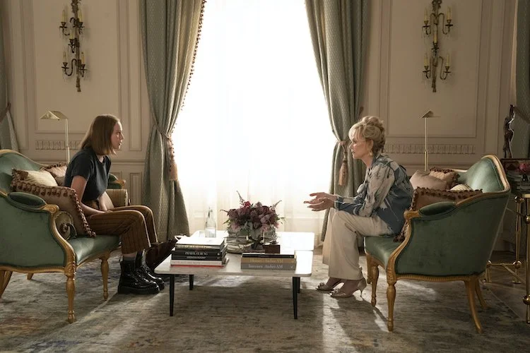
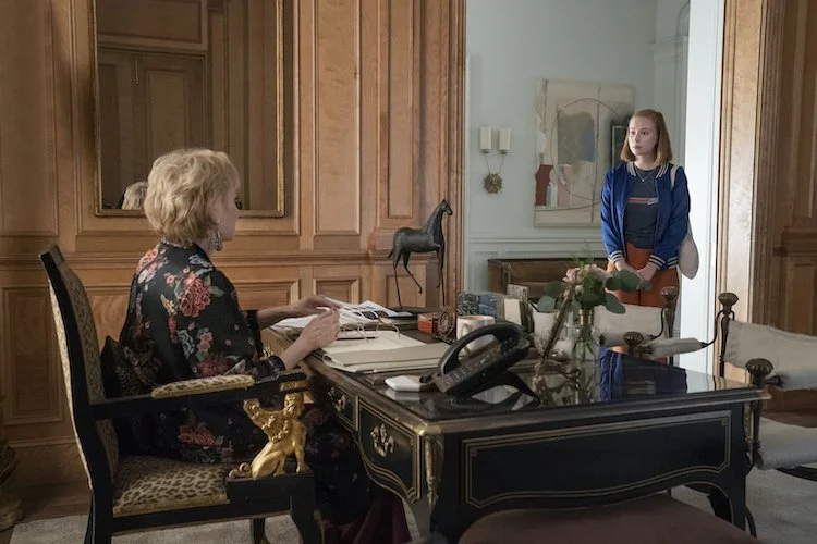
Deborah Vance lives in a Las Vegas mansion approximately the size of Versailles with a humongous collection of salt and pepper shakers. But the veteran comic, played so astutely by Jean Smart on the HBO Max series, is no Liberace. She loves antiques and excess, but it’s all pretty tasteful in its own very Deborah Vance way, with some smashing contemporary art pieces.
When it came to envisioning the comic’s mansion, production designer Jon Carlos leaned toward the type of luxe glamour seen in interiors by L.A. based Atelier AM and the massive designs of architect William Hablinski for inspiration, rather than researching the homes of actual celebrities.
The classical exterior was shot at a home under construction in Los Angeles’ Bel Air neighborhood, while the interiors were filmed on Paramount soundstages. Carlos imagined that Deborah lived in the Las Vegas’ lavish Enclave development where figures like Steve Wynn and David Copperfield have homes.
Conversations with show creators Lucia Aniello, Paul W. Downs, and Jen Statsky also helped when it came to adding in objects such as a soda fountain in the kitchen, the salt and pepper collection and animal prints as a reflection of the Las Vegas standup comedian.
From contrasting colors to sharp angles, Carlos breaks down ideas behind Vance’s home.
The Inspiration Behind Deborah Vance’s Home
Photo Jake Giles Netter
“Very early on in the process, we talked about tone in terms of the portrayal of the environments, and how that would supplement the character.
“From the very beginning, this was important for me to make sure that supported the dramatic aspects of the character development rather than the comedic. We didn’t want it to look like a traditional half-hour comedy, there needed to be a sense of hyperrealism and gravity to the sets.
“We didn’t want any of this stuff to be so hyperbolic or over the top that it would take away from your ability to relate to that character as a human on a one-to-one level.
“I think that’s what’s really amazing about this show is that there are so many different characters that the demographic that it can speak to, and it can be relatable to, is amazing. Making sure those environments could both alienate and relate at the same time, and wouldn’t steer off towards an approach that was so exaggerated it became comedic was really important to us in shaping that.”
Deborah’s Living Room
Photo JAKE GILES NETTER
“In the mansion layout, I knew from the get-go that I wanted to have a style of architecture called enfilade, meaning that all the doorways lined up. Whatever axis you’re on, you could look from one room to another and see a frame within a frame.
“All of Deborah’s life is being captured and each room is segmented, with the living room being the vortex of that. From the living room, you can see Marcus’ office, you can see her office, you can see the dining room and you can see the front door on diagonals.
“It was also about the mixing of antiquity with contemporary and modern pieces — specifically in the art contrasting with the style of the couch or the chairs.
“Our set decorator Ellen Reede Dorros would bring in pops: the zebra poufs underneath the beautiful rococo table that was below a beautiful contemporary painting that was the same color palette as the wall.
“The color palette of the pink was new to me, I’ve never really done shows with pink. That was something that came from Paul, Lucia and Jen. It was about trying to find the right pink. I went through a dozen samples. We had to tint it to get the perfect two-tone pink.
“You can notice that the wall is two tones, the inner panels are a lighter pink and the outer, are all a slightly darker pink.
“There were the sage curtains that were tied to the settee, which contrasted in color with the purple couch on the opposite side of the room. There was always a balanced contrast in color on the sets.
“We had a yin-yang to the balance of the set, which was emblematic of the yin and yang between Deborah and Ava.”
The House in Relation to Deborah’s Personality
Photo JAKE GILES NETTER
“The one line that I read when I saw the script was the comment about it looking like a Cheesecake Factory. I didn’t know whether to embrace it or be scared off by that comment.
“How I interpreted it was that maybe that was a slightly generational comment. Ava not understanding the history of Deborah’s palace and that how off-putting it would to someone young from L.A. who doesn’t have the same background or education in fine antiquities and art might make that comment.
“We had to find that balance where it did lean a little bit into the Cheesecake Factory. We wanted to find a story of where Deborah probably hired an architectural firm and spent 10 years designing this mansion and building it. Halfway through, she fired everyone and went to Europe herself. She shopped at Paris flea markets and galleries around the world.
“We had this joke about how Deborah created her place — that she would hire the best to do it, and they were still not good enough.
“Another contrast we tried to set up was when you look at her living room or the foyer, those are her public spaces. That’s where she’s her showiest. There were animal prints throughout too, and this was more to her fierceness where she brings you into the house and she lets you see the tough side. There is a piece of armor in the front foyer.
“As you go upstairs to her private areas, we brought in more of her softness. There was nothing hard on the couches – everything was soft and enveloping. I think the scripts called out for no less than a dozen pillows on her bed.
“I kind of envisioned the house like a flower, like a rose. The downstairs is thorny and upstairs is where the petals start to unwind and this is where you can see the true Deborah.”
Photo Courtesy HBO Max
The Kitchen
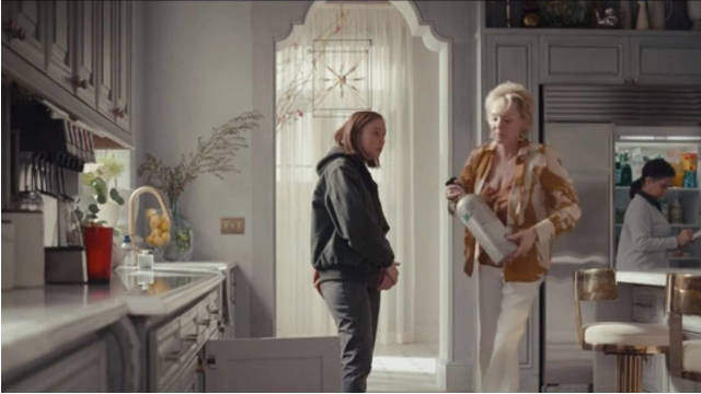
“The kitchen is massive. It’s the size of most people’s houses. The soda machine was a scripted element that Paul, Jen and Lucia wanted in there. It was the perfect amount of 1980s Deborah.
“She never lets go of her past and you saw it with her soda machine, and you saw that with the microwave in her office. The audacity of something so commercial and benign but completely outfitted in this beautiful built-in cabinetry for the soda machine. Then there were the Co2 tanks below that she effortlessly lifts like a heroine and changes.
“You see her drinking Diet Coke throughout the entire show — that’s one of our schticks.
“The salt and pepper display case, backlit through the galley of the kitchen, which Adam Bricker, the director of photography captured, with her standing perfectly was one of my favorites in the series.
Kathleen Felix Hager, the costume designer had perfectly matched Deborah in a teal robe to match with elements inside the case. There was a constant collaboration and discussion about the dominant colors and accenting them. We would work to complement and color balance all of that together.
“[In the pilot], the kitchen is the first room we glimpse of her interior space and her just sitting at this giant island by herself. It’s a room that was purposely gray and cool, with hard marble surfaces, so it felt as if you were a prisoner in this cold place.
Photo Pat Saperstein
Deborah’s collections
“Ellen found most of those objects. The salt and pepper shakers were scripted, and she had an amazing time from antique shops to eBay finding a range of shakers. The prop master, Gay Perello, manufactured the actual hero pepper shaker.
“In the hallway leading to the living room, she had a beautiful collection of antique busts on console tables that I always thought looked so beautiful in contrast to the contemporary art that was right above them.
“Ellen had these unbelievable two porcelain Dalmatians that she put in Deborah’s office. It reminded me of Cruella de Vil. And it was perfect. You could tell they were purchased in the ’80s.”
#emmys #setdecorating #hackshbomax #SDSA #setdecoratorssocietyofamerica #productiondesign


